01 THE PROBLEM
The prescription is digital. The process isn't.
In Turkey it is common people call pharmacies and read out prescription codes, ask relatives to pick up medication, or even request home delivery
Existing journey
Visit doctor or phone call / Get a digital and physical prescription / Call pharmacy / Read prescription code / Ask about availability /
Travel to pharmacy / Collect medication
People with digital prescriptions still rely on manual communication and pharmacy visits to obtain medication, creating unnecessary friction in an otherwise digital process.
01 THE PROBLEM
Turning a prescription into a pharmacy order
Kalfa is a conceptual iOS pharmacy experience that explores how digital prescriptions could be turned into confirmed medication orders without requiring users to call or visit a pharmacy first.
Project title:
Project type:
Solo UX Case Study
Role:
Product Designer
Timeline:
Five-months 2023
Platform:
iOS
Market:
Turkey
Smilebowl

User Research
Prescription calls are already a workaround, participants described calling pharmacies and reading prescription codes over the phone.
Pattern 01
Medication collection is sometimes delegated. Older participants sometimes relied on relatives to collect medication.
Pattern 02
Digital healthcare confidence varies. Participants were not equally comfortable navigating digital health services.
Pattern 03
Finding an on-duty pharmacy creates urgency. Pharmacy access becomes particularly difficult outside normal opening hours.
Pattern 04
Research overview
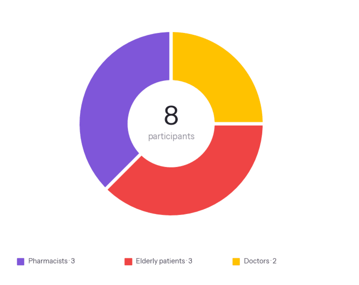
I spoke with 8 people across three groups: doctors, pharmacists, and elderly patients managing repeat prescriptions. The goal was to understand how prescriptions are handled in real life.
Participants:
Groups:
Doctors / pharmacists / patients
Method:
Semi-structured interviews
Duration:
30–45 min
Focus:
Prescription retrieval
8


I compared existing Turkish and international pharmacy and digital-health experiences to understand where prescription retrieval sits within the current product landscape.
Competitive Analysis

03 INSIGHTS
Four things the research changed
The prescription already exists. The friction happens between receiving the prescription and actually obtaining the medication.
Make prescription entry the starting point instead of medication search.
01 The problem wasn't prescription access
Make prescription status, medication information, and next steps understandable without requiring users to remember previous screens or terminology.
03 Healthcare is sometimes an assisted task
Users already have a mental model for prescription retrieval: give the pharmacy the code and ask what happens next. Replace the phone conversation with a digital flow that provides the same information.
02 The phone call is the existing UX
The user who needs medication at 11 PM has a different goal from someone browsing pharmacy products. Emergency pharmacy access needs to be immediately visible rather than buried inside pharmacy search.
04 Emergency pharmacy access is a different job
04 DEFINE
Three People, One Barrier
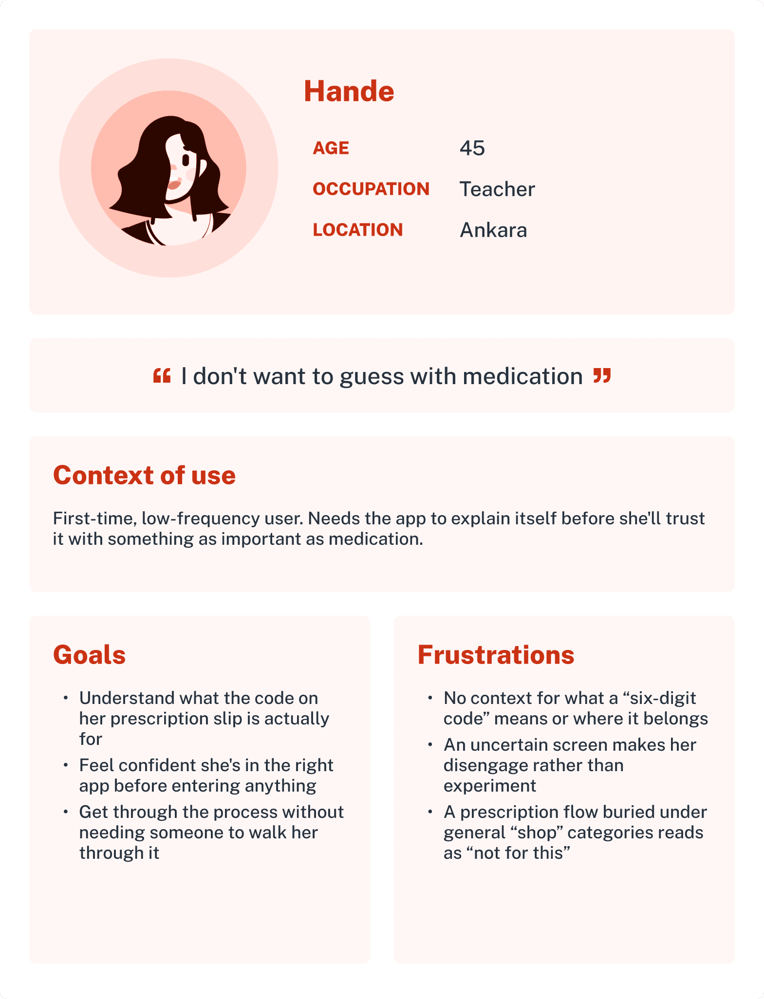
Based on user research, these personas highlight different behaviors, goals, and pain points that shaped the final experience.
Research-derived user types




05 IDEATE
Shaping the Solution
Cart

The user flow maps the complete prescription journey, from signing in and entering a prescription code to reviewing medication, checking out, and confirming the order.
User flows
I structured Kalfa around prescription ordering using familiar e-commerce patterns, from entering a prescription code to checkout and finding an on-duty pharmacy.
Information architecture

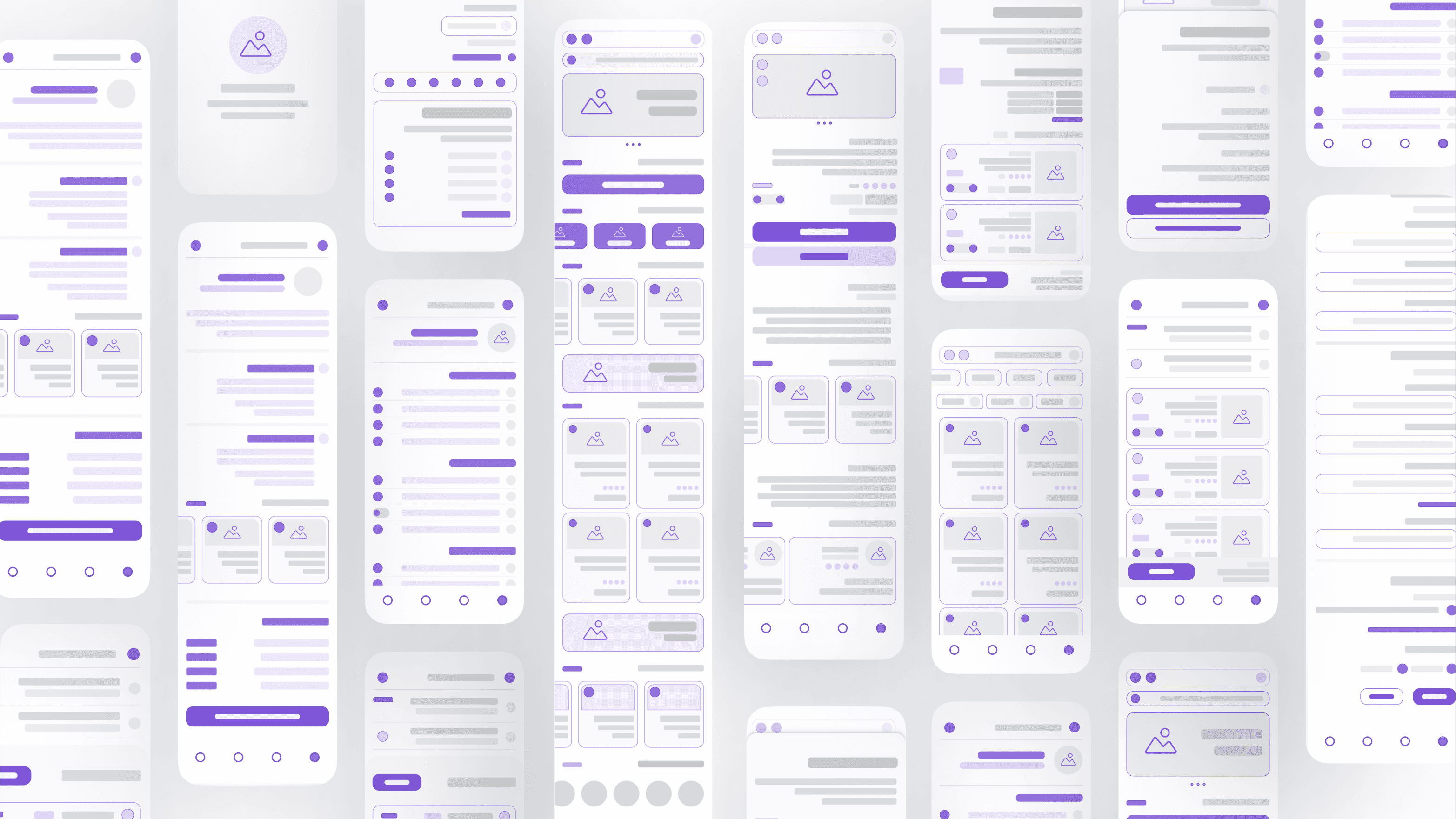
A low-fidelity exploration of the app's layout, navigation, and user flow, used to validate structure before visual design.
Wireframe
Before testing, the redeem prescription button sat directly below the banner. The logic was straightforward: banner at the top, primary action in the middle, everything else below, a clean big-to-small hierarchy on paper.
It didn't hold up in real testing. A 65-year-old user couldn't find what mattered, and the whole screen read like more content to scroll through, not something to use. So I moved the popular categories up and pushed the prescription flow down, closer to the point where someone would actually reach for it.
After
Low-fidelity
Prototype Testing




Before
Low-fidelity
Prototype Testing
The interface was restructured based on real user behavior, resulting in a clearer visual hierarchy and a more natural navigation flow.
Early testing
05 DESIGN
Building the Path
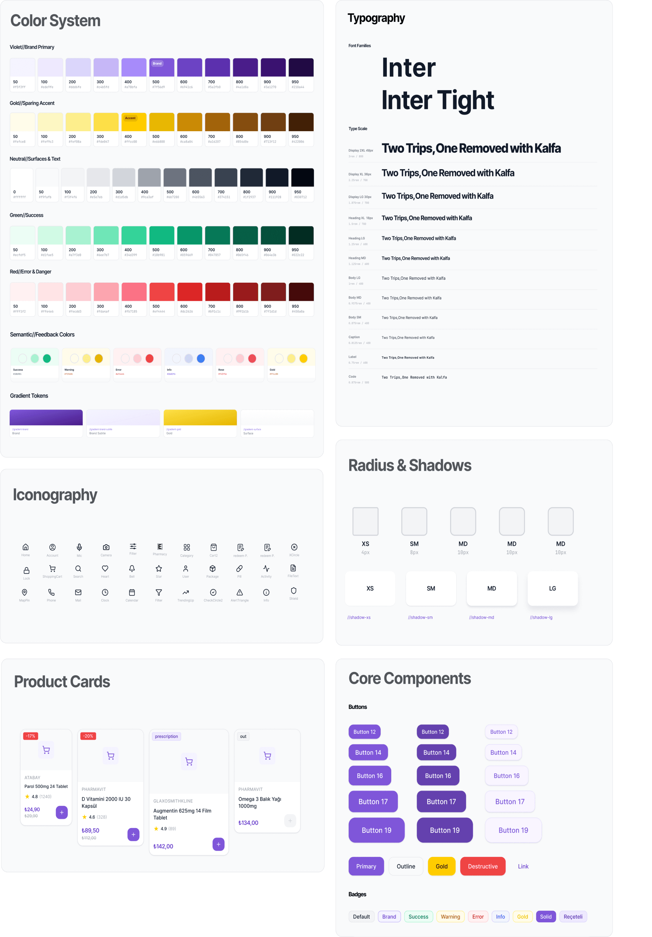
I combined a 4-point and 8-point grid: 4-point for small details like icons and padding, 8-point for the overall layout. It scales cleanly across screens without feeling rigid. The palette follows color psychology, accessibility, and hierarchy. Purple is primary, reading trustworthy and calm without feeling clinical. Yellow adds warmth and draws attention to key actions. Semantic colors keep feedback (success, warning, error, info) consistent.
Design System
Key Features


When users need medication outside regular pharmacy hours, they can open the Emergency Pharmacy feature from the home screen. The app automatically shows nearby on-duty pharmacies, along with their distance, address, and opening status, helping users quickly find the closest pharmacy when time matters.
Emergency Pharmacy Finder

Users enter their prescription details and code, review the prescribed medications, then add them directly to their cart for checkout or home delivery, removing the need for a separate pharmacy visit.
Prescription Redemption
Final Screens
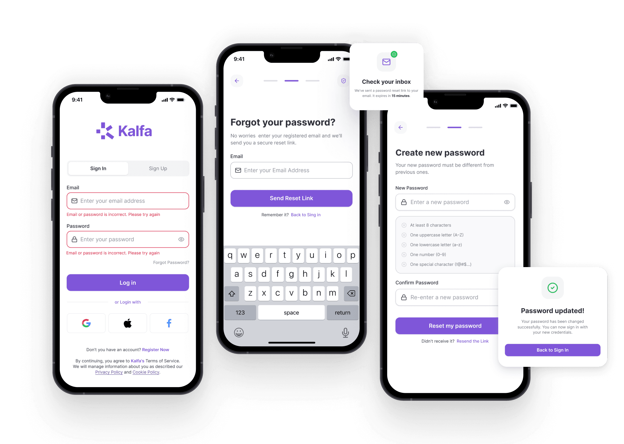
Onboarding, Sign In & Account Setup
Introduces the product, then gets users signed in and their account set up before they reach the main app.
Core Experience
Onboarding, Sign In & Account Setup
Introduces the product, then gets users signed in and their account set up before they reach the main app.
Core Experience
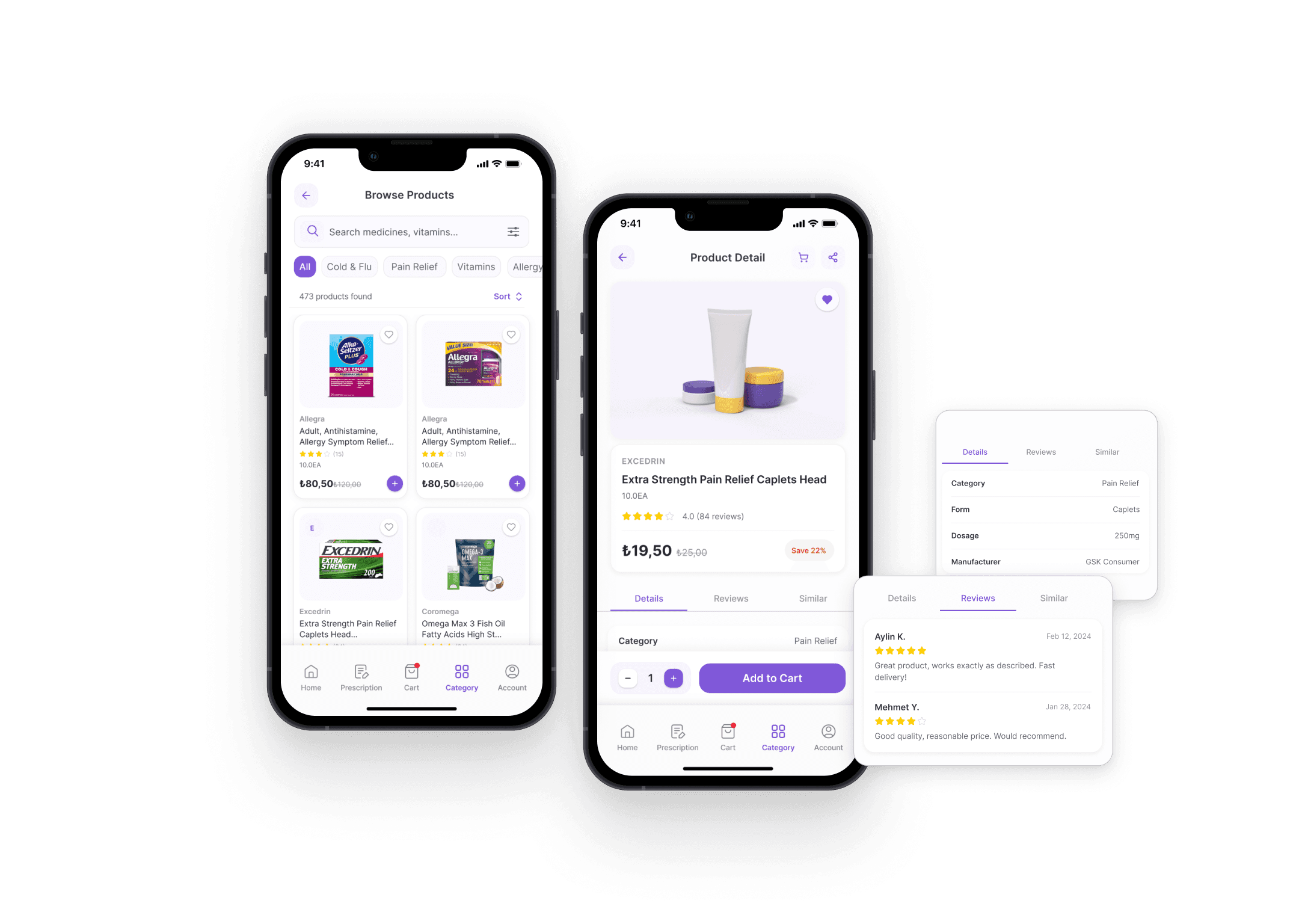
Profile, Settings, Secure Payment & Address Management
One place for account info, preferences, saved payment methods, and delivery addresses.
Account & Payment Management


I started out thinking of Kalfa as an e-commerce pharmacy experience. Research pushed it toward prescription retrieval and fulfillment instead. The phone call turned out to be the real competitor, not other apps. Prescription retrieval became the core journey, not a side flow. Usability testing broke a few assumptions I had about information hierarchy.
What Changed
Prescription verification, Pharmacy inventory, Fulfillment, Delivery Accessibility, Regulatory constraints, Larger-scale usability. Kalfa taught me that healthcare UX isn't just an interface problem. It's users, pharmacies, prescriptions, infrastructure, and the experience only works if all of those hold together.
What Remains Unvalidated
06 REFLECTION
FROM INTERFACE TO SERVICE
The biggest shift in this project was how I defined the problem in the first place. I started out trying to design a better pharmacy app. The research kept pointing somewhere else the real problem wasn't the interface, it was prescription retrieval: the gap between getting a digital prescription and actually walking out with the medication.


