03 THE Idea Process
The Oxides of Nitrogen
I spent quite some time looking for the right typeface for Nitrokey, testing different options and getting feedback from people. I then started exploring the logo mark around the “N” and the key concept. I eventually moved away from the key, as the geometric shapes coming from the “N” felt more interesting and distinctive.
Exploring the Mark
02 THE PROBLEM
The Disconnection
Open source has always been function over form. That's changing, the visual bar for the whole ecosystem has gone up, and Nitrokey hasn't kept up. For a security company, looking dated costs you trust. The old identity worked at the time. "Security key," instantly, useful when you're new and need to explain yourself fast. But Nitrokey isn't just USB keys anymore. Laptops, phones, HSMs, encrypted storage. The logo's still telling the old story.
01 overview
Nitrokey Rebrand
Nitrokey is a Berlin company that's spent over a decade building open-source security hardware: USB keys, hardened phones, laptops, network HSMs. As a self-initiated project, I redesigned their identity from the ground up, starting with a new logo built from the –NO₂ molecular structure, then a full color and type system, an editorial voice, and a social media presence.
Project title:
Project type:
Unsolicited rebrand
Role:
Graphic Designer
Timeline:
Four-months 2026
Platform:
Self-initiated
Market:
Germany
Nitrokey
2
1
While working on the “N” shape, I was also trying to understand Why Nitrokey is called “Nitrokey” in the first place ?
While exploring how to construct the letter “N” using geometric shapes, my research suddenly reminded me of an atomic molecule. I then realized that nitrogen is actually a protective layer in the air around us, working quietly without us even noticing. This made it a fitting concept for combining ideas of security and speed. The idea was there.
1
1
After that, I continued refining the design, making sure every detail was as close to pixel-perfect as possible.
During this process, the logo mark evolved and took on different forms. At times, it looked like two people or even a yin-yang symbol. But I really liked the molecular geometric direction.
04 Concept
05 Logo Construction
The Logic Behind the Mark
The Oxides of Nitrogen
The identity is built around –NO₂, the nitro group. The main idea came from the name itself "Nitro" pointed straight to nitrogen chemistry, and from there the whole visual language followed. Nitrogen and oxygen are also process gases in semiconductor fabrication, giving the molecule a direct link to the hardware side of the brand. The logo combines an S-curve bond with two oxygen-node dots to form an abstract "N," making the molecule and the first letter of Nitrokey the same shape.
Logo Concept
The logo construction is based on simple geometric relationships inspired by the structure of a nitrogen molecule. The proportions and spacing were refined not for mathematical perfection, but for optical alignment, because with curved shapes, "perfect" often reads as off. The result is a mark that feels precise, balanced, and connected to the idea behind the Nitrokey name. The visual system is then built on an R-unit grid, with R as the base radius used throughout.
Logo Construction
A · ø2R
B · ø2R
A–B = 4.33 R
42.6°
1.67R
1.67R
1.27R
C₂ · 180°
5.40 R · 5.42 UNITS
4.92 R · 4.94 UNITS
CLEAR SPACE = 1R MIN.
R
CAP LINE
BASELINE
DESCENDER
CAP H = 3.49 R
.96R
EXCLUSION 1.35R
o · CIRCULAR · ø 2.52R
tittle ø .76R
x-HEIGHT
x = 2.40R
tangent @ 42.6°
n-stem = 1R
0.9 R
N/i
−0.10 R
i/t
−0.15 R
t/r
+0.10 R
r/o
0 R
o/k
−0.10 R
k/e
−0.05 R
e/y
There are four variations, each built for a specific use case.
The logo with slogan is for campaigns and larger brand moments where the message needs room to breathe. The primary logo is the standard, everyday version the default choice for most official use. The logotype is a simpler option for tighter layouts, where the symbol would feel too heavy. And the logo mark is the most compact version, reserved for extremely limited space like social icons and hardware surfaces.
Logo System
Logo with slogan
Logotype
Primarily Logo
Logo mark

A minimum clear space must be maintained around the logo to preserve legibility and consistency. This space is defined by "X" and scales proportionally with the logo size.
Minimum Safe Area
Logo Scaling
Height: 28.41px / 49mm
Height: 52px / 90mm
Height: 88px / 152mm
Height: 130px / 224mm
Height: 188px / 325mm
Logo Background Usage
07 Typography
The Language of Type
Inter’s readability makes it a good choice for Nitrokey and helps give the brand a stronger sense of trust. At the same time, Space Grotesk communicates well with the cybersecurity field. Both fonts provide good readability and contrast, making the brand’s visual language more balanced and distinctive.
32px
Heading / X-Large
32px
Heading / X-Large
28px
Heading / Large
28px
Heading / Large
24px
Heading / Medium
24px
Heading / Medium
20px
Heading / Small
20px
Heading / Small
48px
Display / Small
48px
Display / Small
Inter
Space Grotesk
18px
Body / Large
18px
Body / Large
18px
Body / Large (Semi Bold)
18px
Body / Large (Semi Bold)
16px
Body / Medium
16px
Body / Medium
16px
Body / Medium (Semi Bold)
16px
Body / Medium (Semi Bold)
06 Colour System
A System of Signals
I kept Nitrokey's existing red, adjusting the tone for stronger contrast and better balance across digital and print. For an accent, I tested several options and landed on Steel Blue it fits the cybersecurity context and pairs well with the red, used mainly where extra emphasis is needed. Base colors were chosen to complement both, keeping the palette consistent.
Steel
75969F
#FFFFFF
Gray
ADADAD
#FFFFFF
Paper
Surface · Pure
#FFFFFF
Ink
1A0A02
#FFFFFF
Silver
D9D9D9
#FFFFFF
Nitro Red
B81702
#FFFFFF
F2F5F6
DDE5E7
B9CAD0
94AFB7
75969F
5A7C85
46636B
354B51
253437
161F22
0B1012
F7F7F7
EDEDED
D9D9D9
BFBFBF
ADADAD
8A8A8A
6B6B6B
4D4D4D
333333
1F1F1F
1F1F1F
F5F2F0
E4DDD9
C6B8B0
A28E82
7A6357
52403A
3A2C26
2A1E18
1F140F
1A0A02
0D0501
FACFCB
F4A29A
EC7466
DC4632
FDECEA
B81702
9A1202
7A0E01
590A01
3A0700
1F0300
07 Brand Application
USAGE OF NITROKEY IDENTITY

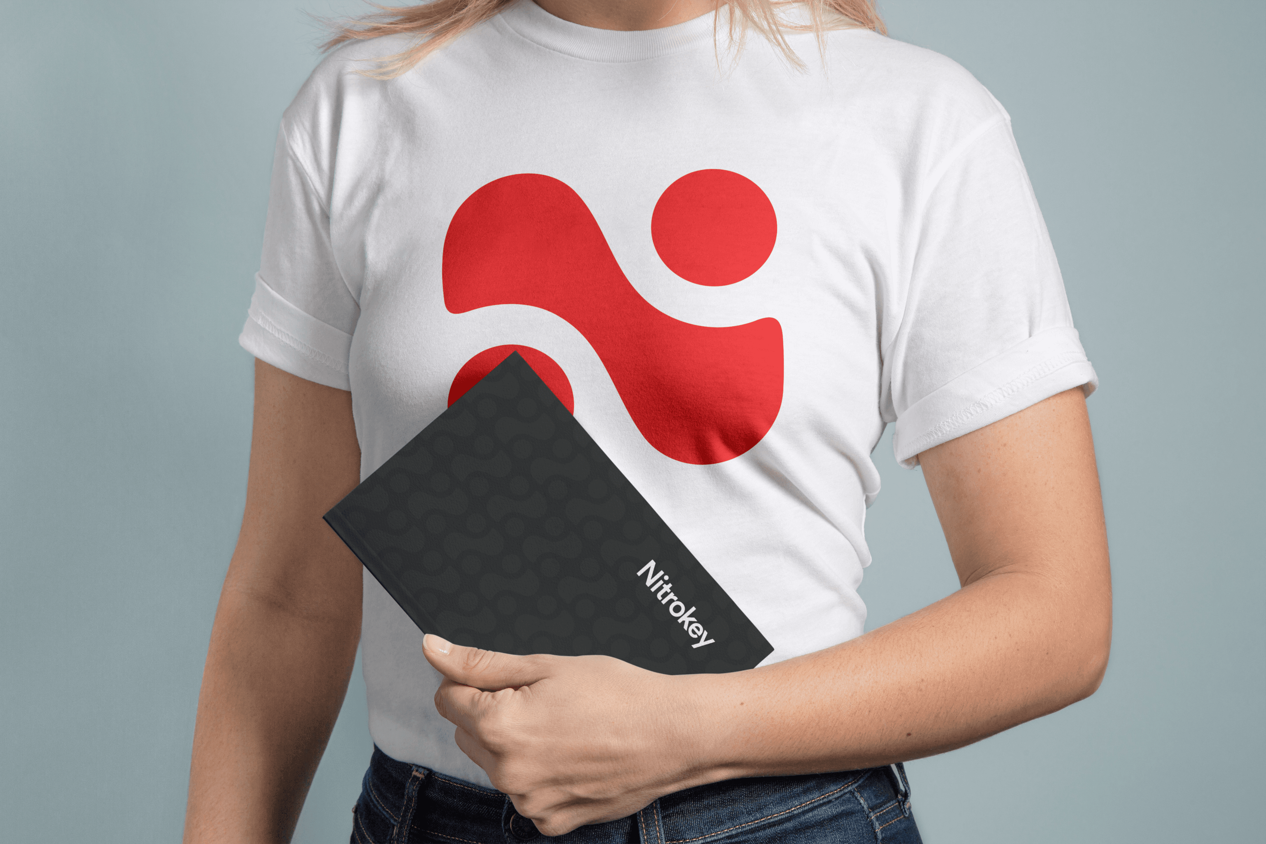


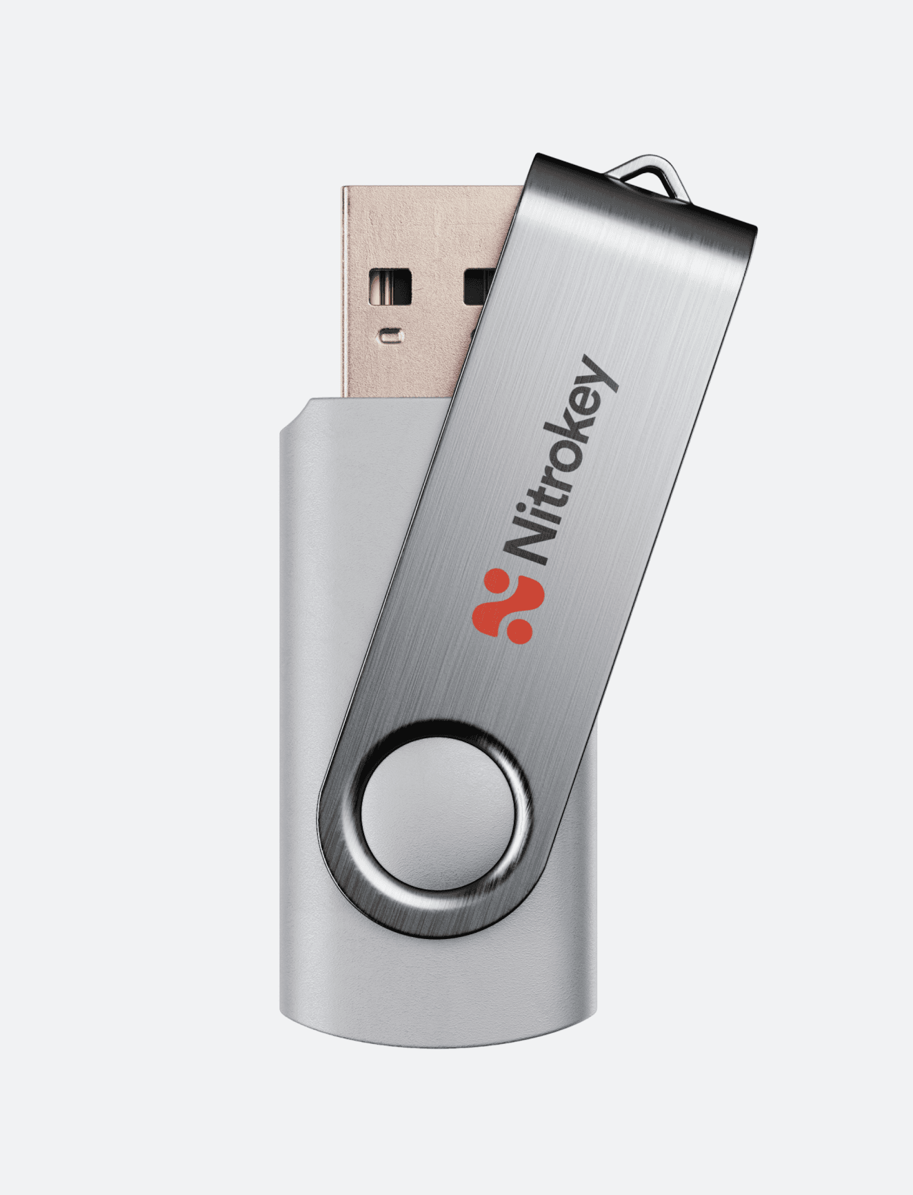


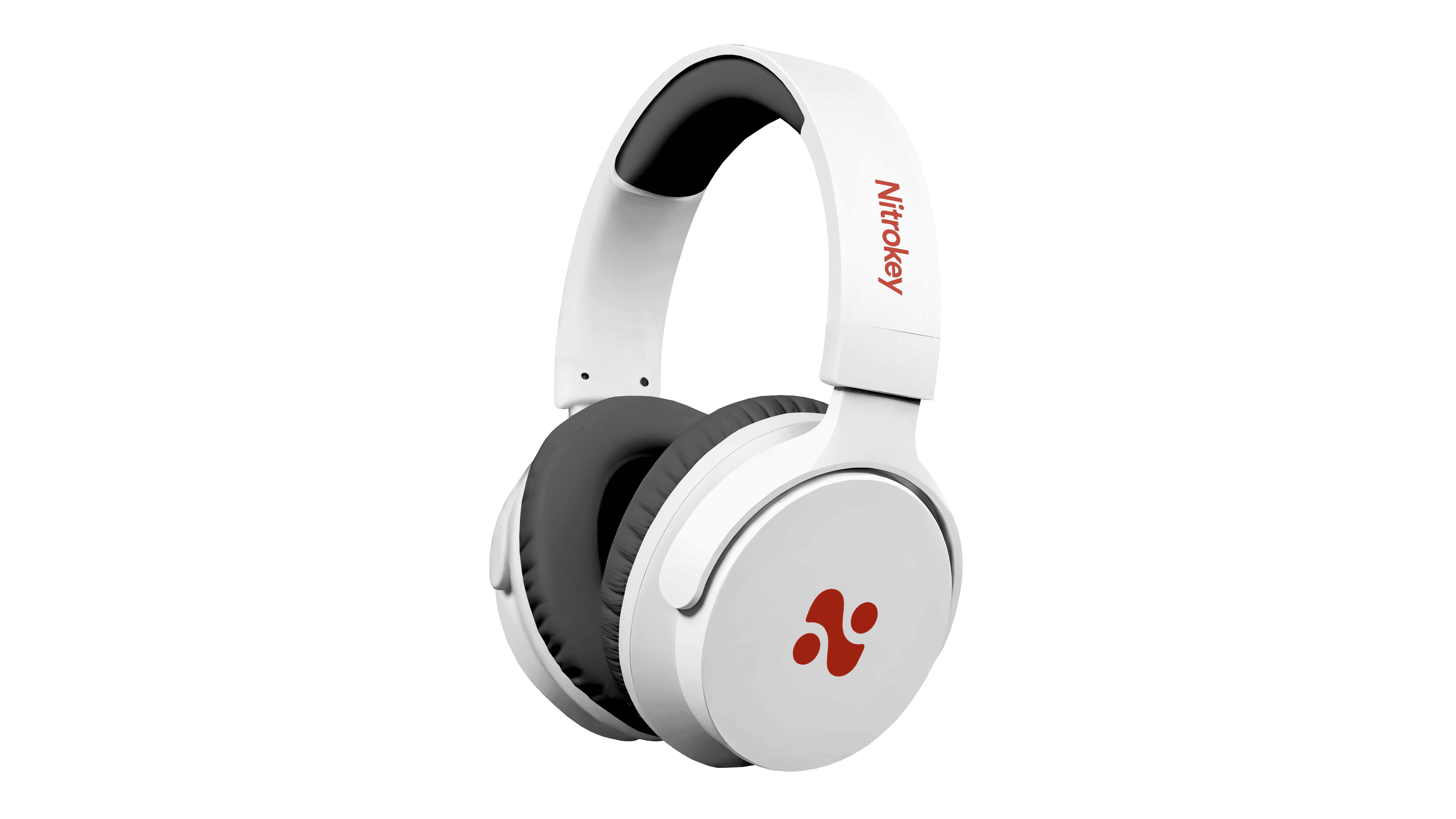


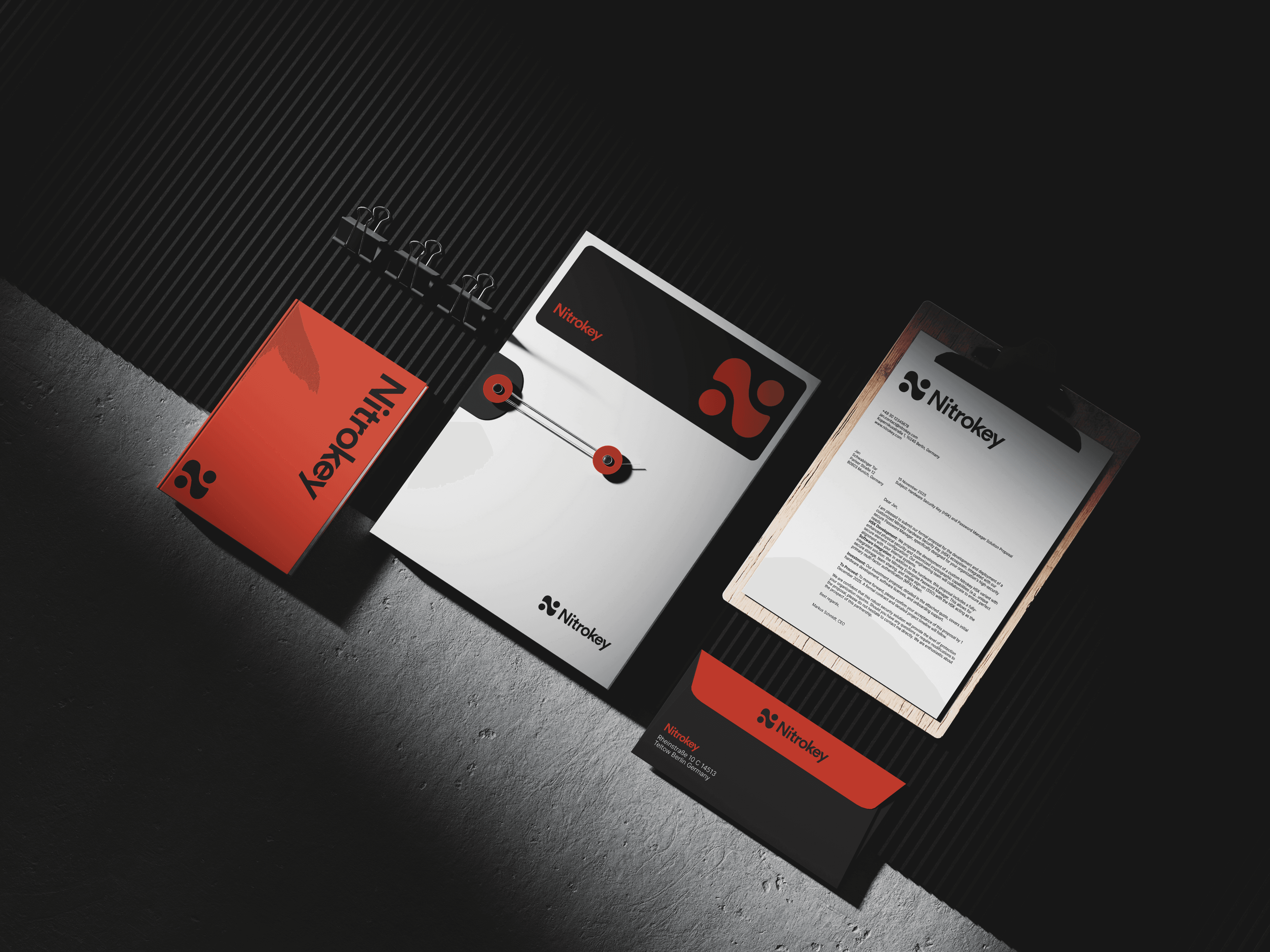

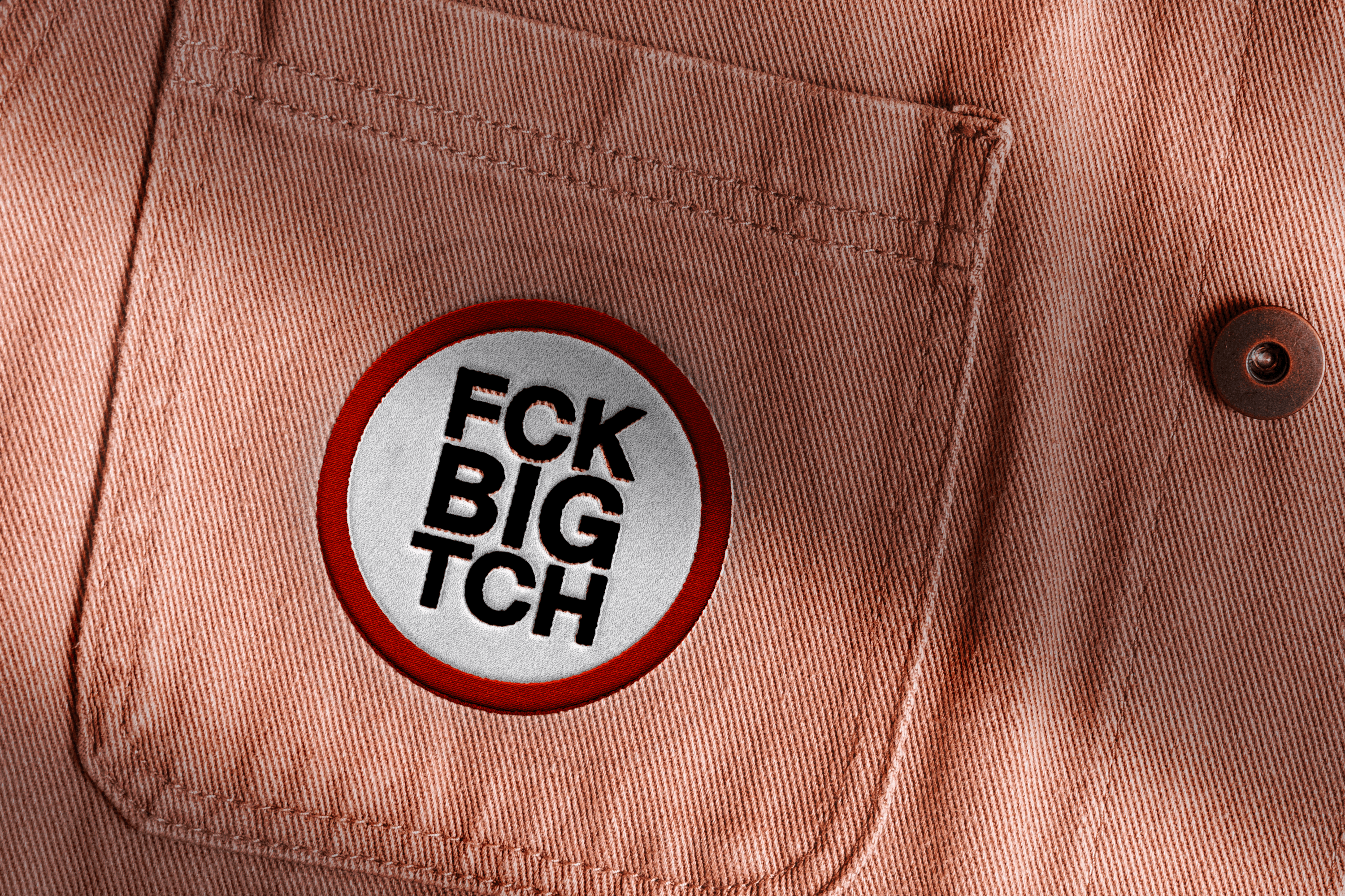


These concepts explore different ways to communicate Nitrokey’s values through social media. The first direction uses collage and visual disruption to create a more provocative tone, while the second focuses on direct messaging and relatable characters.
Social Media
Before
After

The old mark was locked to one product a literal shield-and-USB illustration that didn't stretch across a wider lineup (NitroKey, NitroPhone, NitroBox). The new logo is built from NO₂ molecular geometry, with two dots and an S-curve forming the "N."
At first glance it may not be as instantly memorable as the old one because it's no longer telling a story, it's expressing a structure. But that's exactly why it's more long-lived, it traded a decorative illustration for a structural idea, which is what makes it scale, age well, and actually differentiate. A brand system built to actually scale.
The Impact

Thanks for
your attention