02 Brand strategy
The Sound of a Smile
Smilebowl brings together two simple ideas: positivity and food. “Smile” reflects the brand’s positive approach to healthy eating, while “bowl” connects directly to the product. The name keeps the brand approachable and makes healthy food feel enjoyable rather than restrictive.
Naming
Smilebowl talks the way a good friend gives advice: warm, a little funny, zero judgment. It knows its ingredients and isn't afraid to say why they matter, but it never lectures. It celebrates small wins instead of demanding big ones.
Tone of Voice
Voice Qualities
Encouraging, not preachy.
“Small changes add up.”
Optimistic, never judgmental
“Tomorrow's another good bowl.”
Plain-spoken, not clinical
“Made fresh every morning.”
Warm, not saccharine
“Good food, no guilt trip.”
We don’t say
“You deserve this, queen! 💕✨”
We don’t say
“Undo yesterday's damage.”
We don’t say
“The best salad in Berlin, period.”
Tone Dimensions
Casual
Playful
Clear
Upbeat
Warm
Talks
Winks
Explains
Encourages
Connects
A Story of Smile
Smilebowl is a complete brand identity built for a Berlin food concept centered on vegan salads and healthy bowls. Although the brand hasn't launched commercially, every part of the project was developed to the standard of a real, market-ready brand from core brand strategy and voice to the full creative execution across visual identity and marketing channels.
01 OVERVIEW
Project title:
Project type:
Brand and Creative Stratagy
Role:
Designer
Timeline:
One-months
Platform:
Print, Digital
Market:
Germany
Smilebowl
Supporting neutral palette, used for text, structure, and contrast across applications.

Primary palette ,Burnt Orange, Pistachio Green, Pale Bisque, and Deep Pine shown with an example of the colours composed together.

Burnt Orange brings the appetite appeal. Pistachio Green nods to vegetables without falling into the typical "health food green." Pale Bisque works as a warmer alternative to stark white. Deep Pine adds grounding contrast.
A secondary palette Espresso Brown, Pure Black, Light Ash, and Medium Gray supports text, backgrounds, and packaging details, keeping the system flexible without losing its warmth.
Colour Palette
Primary palette ,Burnt Orange, Pistachio Green, Pale Bisque, and

Small changes,
big health rewards.
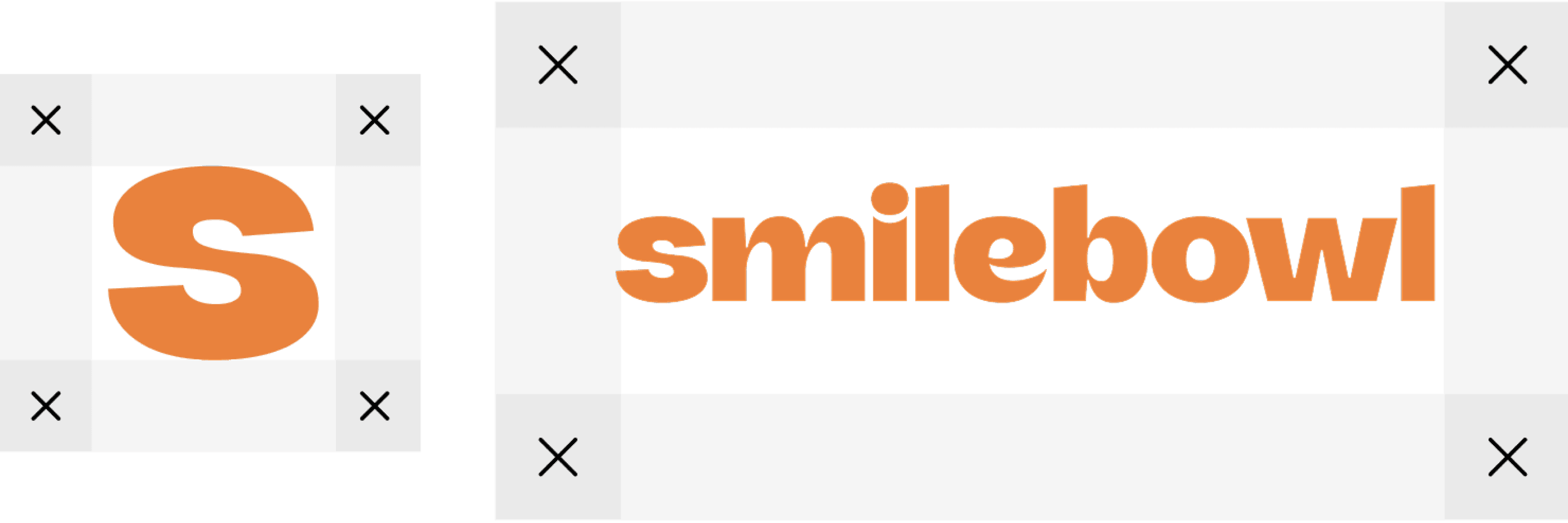
Rounded, lowercase letterforms, approachable, not corporate. Even the "i" plays along: its dot is oversized and round, a small smile of its own.
A compact icon version ("S," same rounded shape) covers anything too small for the full wordmark: favicon, packaging stamp, app icon.
Logo
Primary logomark and construction grid, defining the minimum clear space required around
The visual identity answers what it feels like to encounter the brand on a to go bag, a delivery app icon, a city billboard. Every decision carries the same warmth as the voice: nothing clinical, nothing sterile, nothing trying to convince you it's good for you.
03 Visual Identity
The Face of a Smile

The logo system tested across the full brand colour palette, confirming warmth and legibility on both light and dark grounds.

04 Brand in Application
The Action of a Smile
Food menu, drinks & dessert listings, and QR-code table markers, styled with the brand's checkerboard pattern

Food menu, drinks & dessert listings, and QR-code table markers, styled with the brand's checkerboard pattern

Food menu, drinks & dessert listings, and QR-code table markers, styled with the brand's checkerboard pattern

Food menu, drinks & dessert listings, and QR-code table markers, styled with the brand's checkerboard pattern

Food menu, drinks & dessert listings, and QR-code table markers, styled with the brand's checkerboard pattern
Weights
Micuale Light
ABCDEFGHLJIKMNOPQRSTUVWXYZ
abcdefghijklmnopqrstuvwxyz
0123456789
!@#$%^&*()
Weights
Micuale Regular
ABCDEFGHLJIKMNOPQRSTUVWXYZ
abcdefghijklmnopqrstuvwxyz
0123456789
!@#$%^&*()
Weights
Micuale SemiBold
ABCDEFGHLJIKMNOPQRSTUVWXYZ
abcdefghijklmnopqrstuvwxyz
0123456789
!@#$%^&*()
Weights
Micuale Bold
ABCDEFGHLJIKMNOPQRSTUVWXYZ
abcdefghijklmnopqrstuvwxyz
0123456789
!@#$%^&*()
Micuale Bold
Micuale SemiBold
Micuale Regular
Micuale Light
Ag
Weights
Inter Light
ABCDEFGHLJIKMNOPQRSTUVWXYZ
abcdefghijklmnopqrstuvwxyz
0123456789
!@#$%^&*()
ABCDEFGHLJIKMNOPQRSTUVWXYZ
abcdefghijklmnopqrstuvwxyz
0123456789
!@#$%^&*()
Weights
Inter Regular
ABCDEFGHLJIKMNOPQRSTUVWXYZ
abcdefghijklmnopqrstuvwxyz
0123456789
!@#$%^&*()
Weights
Inter SemiBold
ABCDEFGHLJIKMNOPQRSTUVWXYZ
abcdefghijklmnopqrstuvwxyz
0123456789
!@#$%^&*()
Weights
Inter Bold
ABCDEFGHLJIKMNOPQRSTUVWXYZ
abcdefghijklmnopqrstuvwxyz
0123456789
!@#$%^&*()
Inter Bold
Inter SemiBold
Inter Regular
Inter Light
Ag

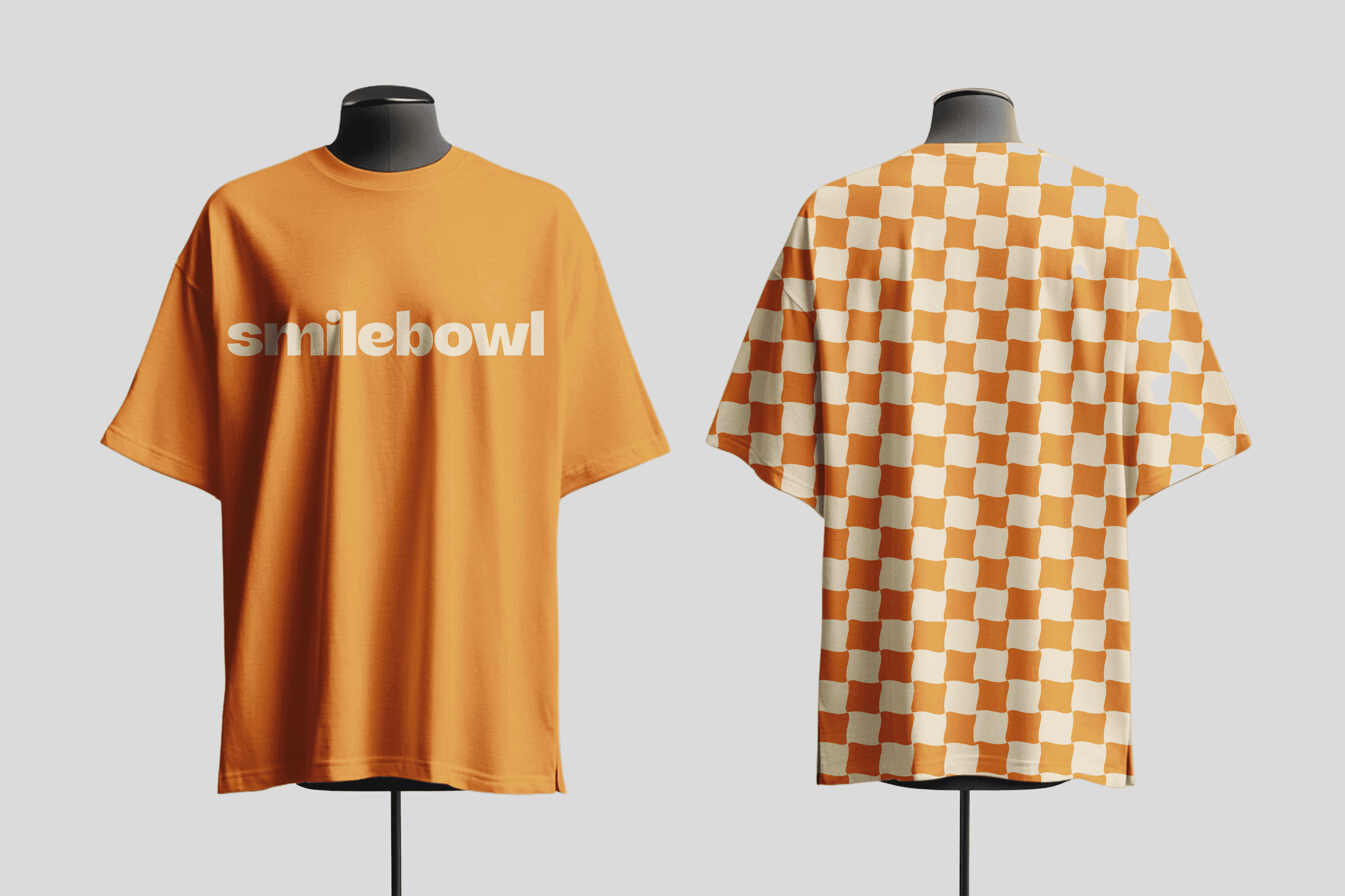
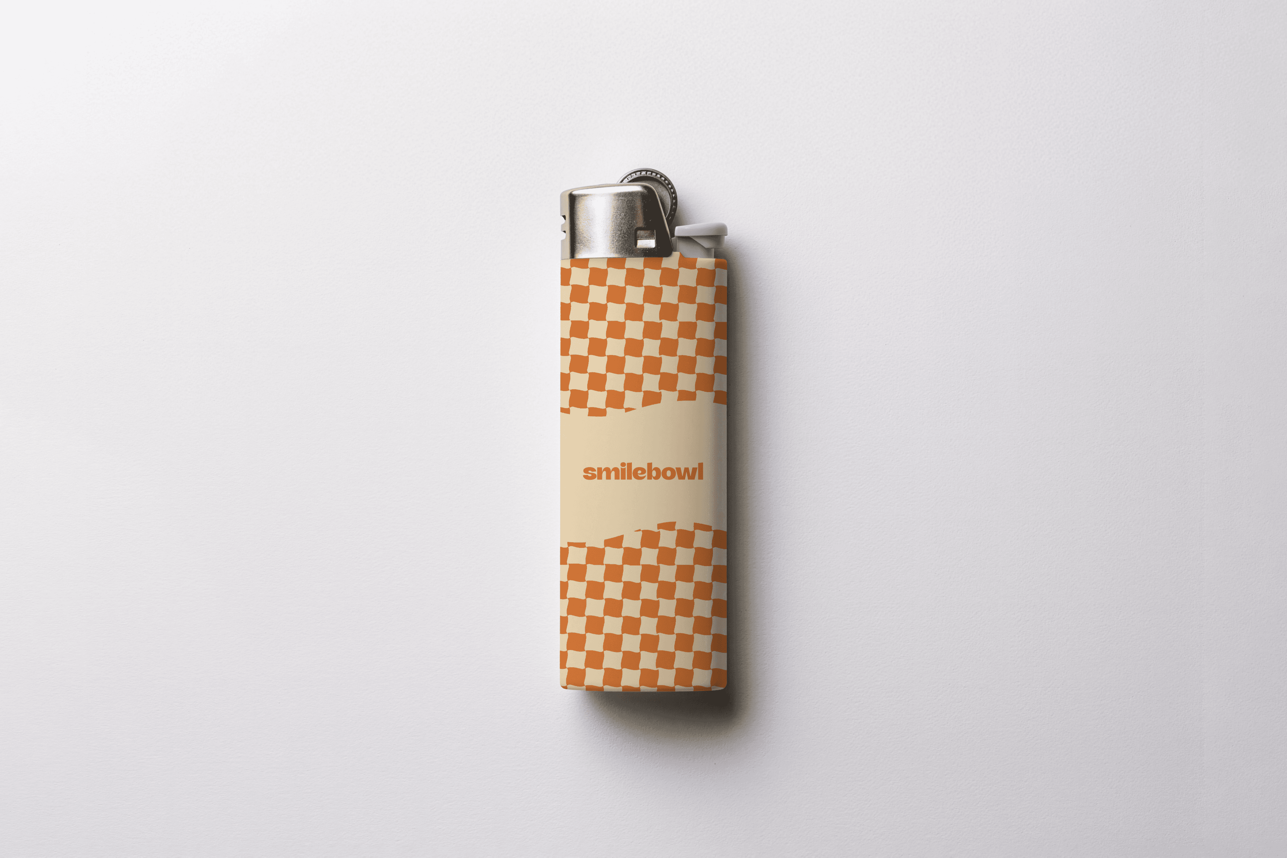
The global tablecloth pattern was added to the design language. It was chosen because it evokes a warm and welcoming vibe.

Graphic elements were designed for social media and other digital mediums.
Graphic elements were designed for social media and other digital mediums.
Click Me !
Hey there!
Small changes add up.

Heads Up!
Tomorrow's another good bowl.
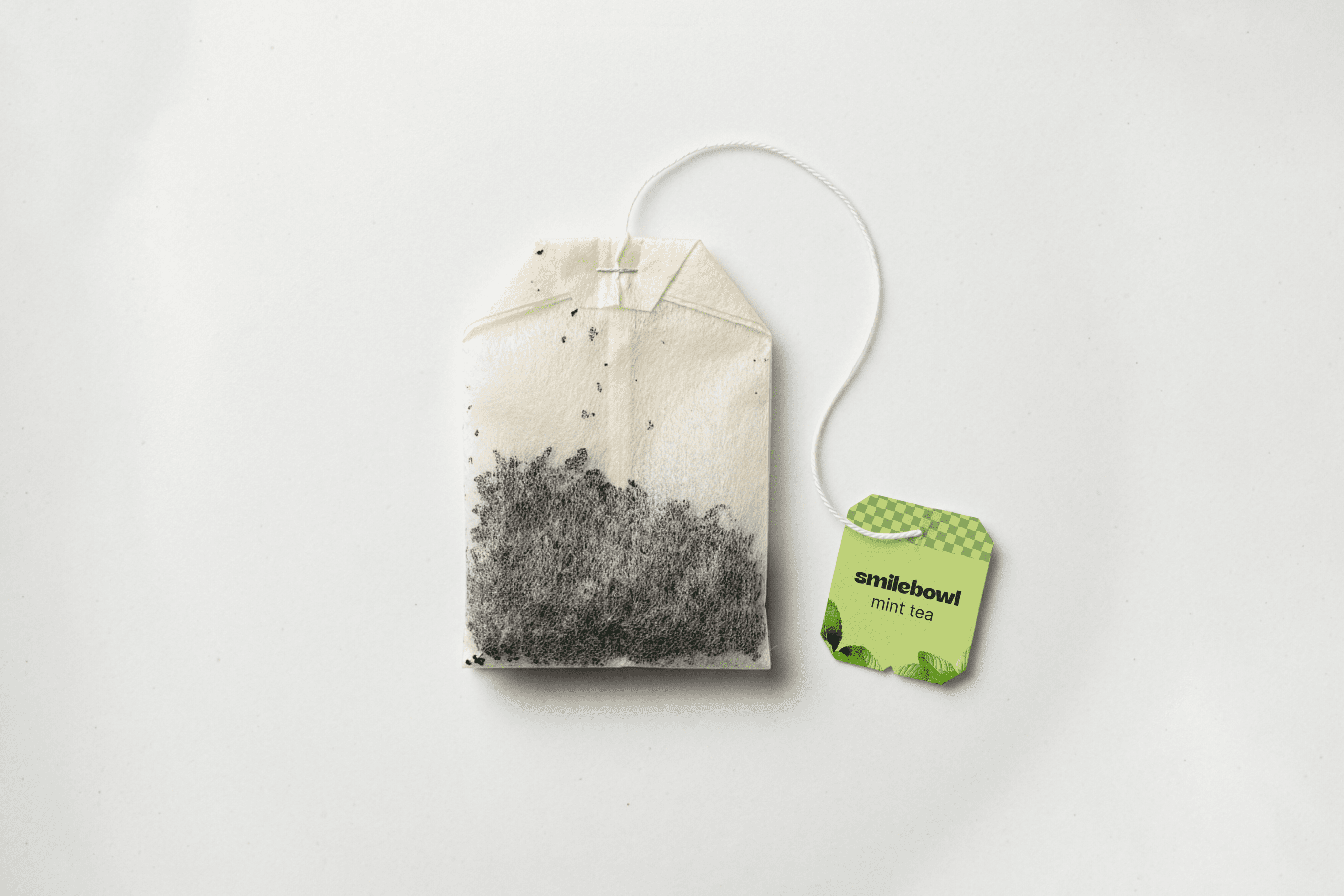
Underneath the logo, color, and type sits a soft checkerboard/picnic-blanket familiar, but in the brand's own palette instead of red and white. The reference stays clear, the colors make it theirs. It shows up across packaging, social templates, and outdoor ads, same pattern, same thread, tying everything
back to one brand.
Graphic Elements
Micuale carries the logotype and big display copy, its rounded curves are basically where the brand's personality lives, though it gets harder to read at small sizes.
Inter handles everything else: body copy, menus, packaging, UI anywhere clarity matters more than character.
Typography

Food menu, drinks & dessert listings, and QR-code table markers, styled with the brand's checkerboard pattern

Food menu, drinks & dessert listings, and QR-code table markers, styled with the brand's checkerboard pattern

Food menu, drinks & dessert listings, and QR-code table markers, styled with the brand's checkerboard pattern
Food menu, drinks & dessert listings, and QR-code table markers, styled with the brand's checkerboard pattern
Instagram post and Story template alongside a set of social tile formats mixing quote graphics with lifestyle and product photography.

Social media is where Smilebowl's voice and visual identity get to be at their most playful — it's how the brand builds the kind of daily relationship a physical location can't sustain on its own.
Social Media Strategy
Food menu, drinks & dessert listings, and QR-code table markers, styled with the brand's checkerboard pattern